Thursday, 21 November 2013

25/09/13 David Severn Visiting Lecturer


mesmall

This afternoon we had a visiting lecture from David Severn, he is a social documentary and fine art photographer based in Nottingham. His work is concerned with the relationship between people and place. More specifically, how individuals and communities interact with or are affected by their environment. In particular he is interested in working class culture and the places associated with it, both historically and today.

David showed us a couple of his favorite projects including, "Thanks Maggie","The Showmen" and then a couple of random shots which he likes. It was interesting looking at why he takes an image rather then taking it for the sake of it each photo had a meaning and reason behind it which was good to see behind the photo.

Thanks Maggie

Briony waiting for friends - former Mansfield Woodhouse Colliery
The Showmen

The Nottingham Goose Fair from the Showmen

Jade visiting her Grandparents at home in their trailer. She wears her party dress ahead of the Showmen Children

A stall holder sits filing her nails while her husband attends some punters.

25/09/13 Controversial Advertising Briefing

Wednesday AM
This morning we had a tutorial as a group with Lance. The subject was academic writing, we recapped writing our reflective journals remembering to write entries for each class, meeting, discussion, workshop and tutorial. We also looked back and discussed why our journals are important - they help us critically think, focus on meetings we have attended, discussions we have had, evaluate our work and performance and express our own values, beliefs and attitudes.

Lance showed us a really useful analysis and evaluation wheel with some great steps and questions to ask when analyzing and evaluating:
What happened?
What were you thinking?
What was good and bad?
Make sense of the situation
What else could I have done?
If it arose again what would I do?

This was very useful along with a presentation packed with useful questions we can use - accessible by Moodle

This then led us into our first assignment "Controversial Advertising". This assignment is split into 2 different sections. The first half and section we was working on this morning was analyzing advertisements - he sent us all off to do some research and pick 6 adverts to analyse from different subject areas: Pre 1990, public information in the UK, product, brand, press/journalism. I found some shocking adverts for these categories which I then printed out to analyse and pick at for understand the meaning - I found a useful book in the library to help me do this (Decoding Advertisements: Ideology and Meaning in Advertising by Judith Williamson)

After this Lance presented the second half of the assignment - we are required to produce a minimum of 2 billboard posters for a product, business, service or campaign. 1 playing it safe and 1 really controversial to society. Straight away I chose that I would like to do it for a campaign as there are a few I feel very strongly about and want to tackle the issue.

18/09/13 Ice Breaker

Met Becky first thing in reception and had a catch up which was great as hadn't seen her since we left for summer so was nice to catch up then followed by the boys coming in we also had a chat with them. Was lovely to see everyone again. For me the first day back was almost an ice breaker session really. Getting 2nd years mixing with 1st years, we all crammed into the art studio and sat through a presentation led by Lance which was all about modules and changes for this year such as the 1st years modules were different to ours last year and so on.  We then did this fun quiz, it was a laugh and a great way to get back into college and mix with everyone in the room - it was a fun activity for first thing in the morning!

Then we did a drawing task led by Mark, we were asked to draw a caricature of ourselves and then around it draw objects and write words about things that we could bring to the course and also list what we could improve. Straight away a hate - drawing people, I cannot draw people so I was dreading it a little but as it was caricature it didn't have to be precise and again this was a laugh as we all had a giggle at each others funny drawings of ourselves. This was also a good chance to talk to some of the first years at the same time and get to know what sorts of things they like, their skills and what discipline they were going into.

It got me thinking about what I can bring to the course and also think about what I can improve. So I compiled a list of each:

What can I bring to my course:
Software Skills (Ai, Ps, Id, word processing, powerpoint)
Leadership skills
Organisation Skills
Creative Thinking
Graphic Design Skills
Creativity
Drawing Skills

What can I improve:
Presentation skills (Confidence when presenting)
Working with clients
I could brush up on software knowledge

Listing these will help me tailor my upcoming projects to work on what I need to improve on and also I can add to the list as I go long and find weaknesses or areas I could improve on.

18/09/13 1st Day Back

First day back. I'm a little nervous - I don't know why, perhaps because its been such a long time off. Need to get back into the swing of things and get used to the workload all over again and in particular keeping up with this journal. I was a devil for that last year so this year I need to keep on top of it to make sure that I don't get behind with it.

I am really looking forward to seeing everyone again though and seeing what they have been up to over the summer, see if anyone's got any projects lined up. I'm also looking forward to seeing the new 1st years, what will they be like? how many of them will there be? Its all exciting and nervous at the same time. I think after such a huge break off I need to get straight back into it.

Norwich Film Festival Poster Competition 2014

Last year I entered the Norwich Film Festival Poster competition. I only submitted one design, it was a very basic design as the important details had to be altered at a later date after selection of the top 8 posters. Mine made it into the top 8 which was a great achievement! however I didn't keep track of my emails and after many emails of Norwich Film Festival the competition closed and I hadn't edited and resubmitted my poster with the dates and location of the event so my original poster was submitted for judging alongside all of the edited submissions of other creatives. So obviously I didn't win because of this however to get into the top 8 was great considering I was really disappointed with the design and knew I was capable of much better. So this year I have come back to it and have myself more time to design a range of posters for the event. I hope to submit more than one so that there is a range for them to choose from.
This is my submission for last years competition. I was disappointed that I hadn't read the emails to change it ready for the final judging. But it was still in the top 8!
2014 Brief

We are looking for one artist to design a poster for us, which will be used during the 2014 Norwich Film Festival. The competition is FREE and OPEN TO ALL. Entrants should send their designs tosubmissions@norwichfilmfestival.co.uk with ‘POSTER COMPETITION’ as the subject line.

1. We would prefer posters to be portrait, but landscape designs will also be accepted.
2. Posters should be scalable, and be ready to print on at least A2 sized paper (420x596mm) without degradation.
3. Please send us your high quality image file (jpg, png, tiff etc. No programme files such as .ai) as a digital file either via email or download link.
4. a) It must feature the words ”Norwich Film Festival”, “Spring 2014″ and our URL.
4. b) When the dates for the 2014 festival are confirmed, the poster will need to be updated.
5. No other text should appear on the poster without written permission from NFF beforehand.
6. The first phase of the competition (general submissions) closes December 1st 2013.
7. The second phase of the competition (public vote) will begin on January 1st 2014.
8. The top three designs will be announced on January 24th 2014.
9. The winner will be announced on February 1st 2014.


I started to look back at some older winners for the competition and I also looked at other film festival posters. Designer Saul Bass created many film festival posters so I looked a lot into these and looked at his style, color choices, composition and type. I wanted to incorporate cameras into my designs purely because of the theme - film. I did plenty of research into the event and made sure I knew what it was about so that my posters could reflect that. The deadline for submissions is December 1st so I hope to have done at least 2 more designs by then so I have a range to submit.
This is one of my designs for this years competition. It is fairly similar to my other submission (below). It is fairly minimalist however it is bright and stands out. The viewer can clearly see what it is for.
This is my second design. I have gave it a dark background so that everything else on it stands out and has a neon feel. I think this is effective and the filmstrip border across the bottom creates a border for the small-print and logo at the bottom.
                                                

Summer Project - Paisley Animals

I have come across many inspirations over the summer – I have particularly taken an interest in the paisley pattern after coming across an image on the internet of a rabbit with a paisley influence. This has led me to start a project based on the paisley pattern incorporating it into drawings of animals.

This is the image I found on the internet which really inspired me. I was intrigued as to how the shape of the rabbit was formed of the paisley pattern.
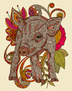
After finding this image of the rabbit I wanted to look what other things people have done incorporating paisley and animals so I did a simple Google search and found some really intricate and stunning designs.They aren't as such paisley but it is intricate pattern put into the shape of the animal.


I have made a start on 2 of my own designs already, one being a cat’s face and also my own take on a paisley inspired rabbit, I drew these out then went over the top with fine liner to allow it to be scanned into the computer better. Then using Photoshop I have edited the drawings adding colour, bold outline etc.


I am pleased with how they came out once I had edited them and coloured them in on Photoshop. I would really like to do some emulsion prints of the edited drawings onto canvas. I tried this at home but unfortunately it did not work, I’m not sure if I didn’t leave it long enough to dry or I just did the process wrong so I hope to retry this when I go back to college. I would like to incorporate mixed media into this project as much as I can. I hope to incorporate my artistic skills into this project by possibly making prints, sketches and paintings of the paisley animals. I also hope to create canvases and textile prints.